• Hey all, due to some issues with false DMCA takedown requests, we've had to remove and censor a few things until the situation is resolved. Sorry for any inconvenience.
  • Be sure to join the discussion on our discord at: Discord.gg/serebii
  • If you're still waiting for the e-mail, be sure to check your junk/spam e-mail folders

Recent Works

Sawp guys, I haven't posted a thread here in a while ^^;

Anyway i finally moved on from gimp and got cs5 recently, so I've been busy and will try and keep this reasonably active. Now for the important stuff- banners and drawings.

volca.jpg


meta.png


yeh they're the only two I'm proud of recently...

Digital Drawings:

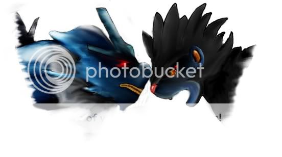
riolu-1.png

shuckleavy.png

bullavy.png

wooperpolice.png

sleepywooper.png

wooper.png

woopavy.png

sheddy.png

regi-1.png

gensplit-1.png

baru.png

goruggo.png

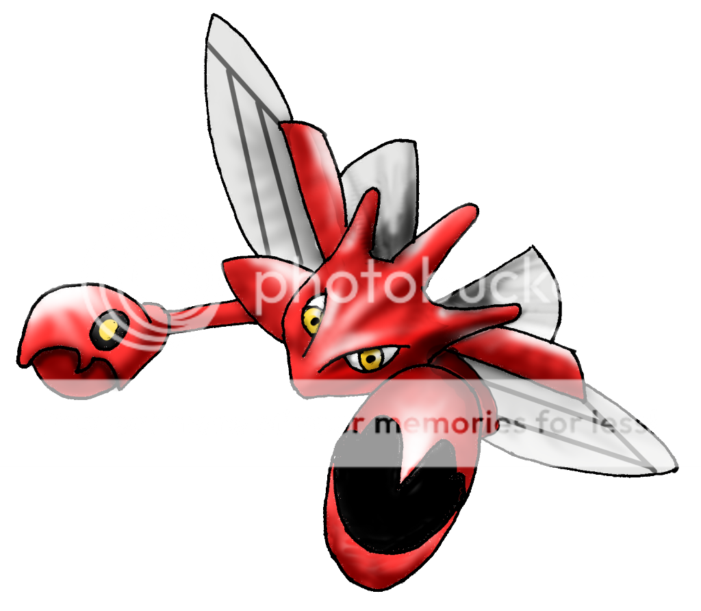
scizfinal.png

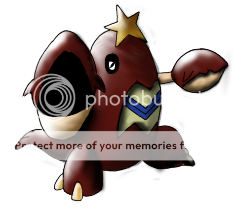
crawdauntcoloured.png

MekkahZytoid.jpg
 
I love the banners. You have a very clear look on the light-source and it gives an amazing contrast.

Maybe try out C4Ds and/or texts?

I also like the way you use brushes. It gives the graphic some sort of "impact".

I don't know anything about the drawings but they seem decent.
 
WHAT?! WHERE ARE THE STOCK IMAGES!?!?

Oh, well, Giggity looks like you moved on :)

Love the first banner, beautiful light source, and loved the "fading" of volcarano (or was it?) near it's rear.
 
I love the banners. You have a very clear look on the light-source and it gives an amazing contrast.

Maybe try out C4Ds and/or texts?

I also like the way you use brushes. It gives the graphic some sort of "impact".

I don't know anything about the drawings but they seem decent.

I hate using text :< (because I can't do it xD)
Buut sure I'll try out some c4d's

WHAT?! WHERE ARE THE STOCK IMAGES!?!?

Oh, well, Giggity looks like you moved on :)

Love the first banner, beautiful light source, and loved the "fading" of volcarano (or was it?) near it's rear.

Nobody wants to see my stock images :< yes it is Volcarana. Thankyou for your comments both of you :3
 
Its such a shame when people don't notice your awesome works. I love them. Hot banners you got there! I don't like Text at the best of times either. Keep it up yo! Love them.
 
Haaya der, giggty :3

Your bannerz sure did got my love <3 the first one have an nice texture on it and the pic goes there so well, fit it
The second banner look rocks, and i like the trap you used on the both banner, teach me? =)

And i guess i did tell ya about my opinion on your draws, keep up this way giggty ~ <33

What did happen to your stock image? D=
 
Its such a shame when people don't notice your awesome works. I love them. Hot banners you got there! I don't like Text at the best of times either. Keep it up yo! Love them.

Thankyouu <3

Haaya der, giggty :3

Your bannerz sure did got my love <3 the first one have an nice texture on it and the pic goes there so well, fit it
The second banner look rocks, and i like the trap you used on the both banner, teach me? =)

And i guess i did tell ya about my opinion on your draws, keep up this way giggty ~ <33

What did happen to your stock image? D=

haha hi P!nk :3

The second banner look rocks, and i like the trap you used on the both banner, teach me? =)
shhh its a secret.

thankyou for the lovellyy comments :D
 
Looks very good.

Nitpicks; Nidoqueen looks pixel-y; oversharpened? The text could do a little closer to Nidoqueen and a different font would be better.

Good light source and smudging as always.
 
look niice, and dude you should try another style, i know you do know many then diis one :3
And it's will be lovely to have an request in your shop, if you have one x;
 
Looks very good.

Nitpicks; Nidoqueen looks pixel-y; oversharpened? The text could do a little closer to Nidoqueen and a different font would be better.

Good light source and smudging as always.

I know, I didnt realise how poor the quality of the nidoqueen was until I'd nearly finished. I tried to mask it but it didnt work =//

look niice, and dude you should try another style, i know you do know many then diis one :3
And it's will be lovely to have an request in your shop, if you have one x;

I know, I should probably try other styles but I'm lazy atm xD Although my next one is a bit different, I'm messing around with sharper light more. Also request here if you want, i don't have a shop.

Most recent:

Tornadus.jpg
 
You've definatly improved on your banner making skills, you seem to have gone towards a mix of grunge and C4D usage.
Now you have to watch out for over contrasting which will make the images look over sharp, but on Metagross it looks out of focus, so you might want to do some manual sharpening, but you have a good balance of light and texture in your banners.

Now you have to do some work and experiment with text placement, font choice, and text blending, using the same font and style of text on all of your banners highlights the limitations of your graphics.

With your drawings however, they are good, but if you're going to make them WBG you MUST watch out for the colouring that exceeds any of the lineart, if you don't erase the excessive bits or it has extraction problems it will ruin the otherwise good drawing.

But theres definate improvement here.

Yeh, I don't really use any c4d's, its just effects generated using lots of colour dodge layers and linear light, along with some blended brushwork. I'm finding it quite difficult with the contrast now, photoshop is so much more sensitive than gimp xD (and so much better.)

Text is still my weakness, I cant seem to get dafont into my photoshop and then my skills after that are still limiting. I've given up on my drawings now really, moving back towards tradtional art.

More Work: Just experimenting really.

spidericon.jpg


sipderman.jpg


Floatingonacloud.png


skyla.png


deathnote-2.png


My first piece of traditional art in a while, so go easy on me xD I really struggled with the feathers :(

eagle.jpg
 
Back
Top